Tuesday, December 25, 2012

The Grand Finale

So I'm finally done with college! The day that I thought would never come has now come and gone. The graduation ceremony was so much fun and emotional.

With graduation came my finishing up in the photo program. This semester we studied under Peter Goin, not only a great teacher but a great photographer. Look him up; seriously.

We were given the task of creating two mural sized panels; meaning 44x64" prints. I chose to print on satin exhibition canvas. I only wish I'd discovered canvas earlier. The paper smells kind of awful, but the final product looks so great when it's stretched out.

I'd never worked with canvas before so I enlisted two of my classmates to help with the construction of the stretcher bars and stretching the canvas.

This might've been the point where the drill bit actually
broke off into the wood. 


Stretching the canvas. It was surprisingly difficult
and required a certain technique.


One down, one to go. Thanks so much guys!

So we each created two panels and we all put them up in a gallery show in three of the brand new galleries on campus. One thing that struck when putting the prints up, was that this was the end. And looking around I was able to see how good my peers are at our chosen craft. Some of them I'd been in class with them for the last four semesters, this past one being our fifth together. It'd been so great to see how everyone had evolved and changed along with their work.
Getting everything unloaded to start up with the 
installation.
Laying out my prints before they go up onto the wall!
And they're up!

Everyone working so hard on the install!

We must've measured out our spacing a dozen times.
Took forever, but was well worth the work!


 Me with my prints at the opening!

We treated ourselves to some celebratory pizza after 
the opening was done. Such a good end to 
such a great night!

I wanted to end with the group photo because it's 
such a good photo and we all look super classy.
These are peers. Look for their work 
in the future! I want to thank each of them
for contributing to my work. Some more than 
others, but it was a collective process.
I'm gonna miss you guys!


Tuesday, September 25, 2012

Flattery will kill it DEAD

Recently, there has been much discussion about where the line is drawn, if there even is one, between appropriating or copying another artists work.


Many art teachers will tell you art is simply adapting and refining past art. But what's the difference between refining and copying? This particular discussion can go on endlessly, and it isn't the point to this post.

I've actually had my work "refined". It's an irksome feeling, especially when you're work is much better.

This is the final image I turned in for a project, about 2 semester ago. Literally the next project, a classmate turned an image identical to the composition and style of mine, simply a different subject matter. I walked into the class and my friend simply said "Wait till you see Bob's..." I wasn't too impressed with the image. When I had done mine, the critiques were overwhelmingly positive. And the reinterpretation, I felt diminished my work.

But that's just my personal experience with the subject. Another issue with "refining" is that the more it's done, the less powerful the images become. "Imitation is the highest form of flattery". Well flatter a style of work enough make it cheap and unoriginal. The revision of Barbara Krugers work above is pretty much the point.

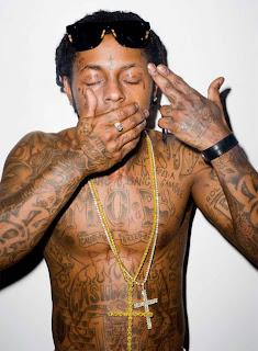
I've recently gotten into the work of Terry Richardson. I'd seen his work before and loved it, but it's only been recently, this week actually, that I've been able to put a name to the art. His style is simple. Shooting portraits on a bare background with only a hot shoe flash on his camera. He is also Lady Gaga's photographer.


(Check out the Barbara Kruger shirt)


And the man himself,
Terry Richardson

What becomes dangerous with work like this, is that assumptions are made that it's easy. This idea can actually be applied to every style of photography; hence the Walmart Picture Studio and "photographers" running a business from home. Soon, people who think Instagram makes them photographers will be taking a crack at Terry's style. 

The best analogy I can come up with for what happens is via music. When a new song comes out, we put it on repeat and hear it over and over on the radio. We listen to it so much that the song is ruined and becomes awful.  The same thing happens with styles of photographers, it's done so much that people lose appreciation for the original artists work.

And this isn't to say you can't be inspired by Terry Richardson or me or any other photographer or artist. But make it your own.

Until next time...
(don't forget to like us on Facebook https://www.facebook.com/erinbeephoto ) 


Monday, September 17, 2012

Awkward.

Art, like anything else, has styles that come and go. Some photographers style's are classic and will astound people 50 years from now. Others....not so much.

There are tons of websites dedicated to awkward family portraits or awkward studio portraits. Most are circa 1995, which pretty much explains everything. The 1990s weren't the best years for fashion and style.

Here are a few images that made me laugh:

As photoshop became more available to people
there was a lot of experimentation with it, trying 
out different techniques. This one I would
label a miss.

There is zero excuse for this 2006 was more than 
enough time for the tainted fashions of the 90s to 
have faded.

Baller.

I would be willing to bet big money that the ball
was meant to be a reference point and the 
photographer was to put in a globe. 

Tacky backdrops and cheap portraits studios are the 
mullets of the photography world.
I strongly suggest against photographing yourself
with your collection of anything. It makes you 
look crazy.
Again...crazy.

I hope these made you smile. Have a fine day!

Don't forget to like us on Facebook https://www.facebook.com/erinbeephoto


Thursday, September 13, 2012

Moving Up in the World

OK, OK. I know you've been missing me. I've been doing fun and not so fun things. So lets just say I've been on a blogging sabbatical.

Some exciting news. I'll be graduating COLLEGE in December! Battling the financial aid office has been awful. But the count down to graduation has begun.

With the "real world" right around the corner, I've been working the business side of my work. While I did have a website, there wasn't much beyond that. So I've been working on things.

The first of which has been the development of a logo for Erin Bee Photography. I did it myself, and it came out pretty good, if I don't say so myself. I'm not a graphic designer, and so I'm sure the logo will go through an evolution over time. But here's what it is right now.


The next thing I did was create a Facebook presence for Erin Bee Photography. So if you haven't already, go to Facebook and LIKE us! Or just click https://www.facebook.com/erinbeephoto

I've written up a client contract. I felt like not having one was leaving me open to being screwed. So I did some research and looked at other photographers contracts and came up with two pages. First page is mostly basic information. Second page outlines the fact that the images being produced are copyrighted by the photographer (that's me). Also spells out fees and cancellation policies. 

ALSO! I got myself a shnazzy card reader from Square. I hook up to my phone and open up the app and I can accept all major credit cards. Which is exciting. It takes me from being a cash run business. One step closer to being legit. 

I've got a few projects in the works, so stay tuned!


Tuesday, July 10, 2012

Camera Magic

As a photographer, I shoot mostly with models. I'm not really a landscape or still life photographer. So whenever I have a project I need to find a model. For smaller projects, I usually make my friends get in front of the camera. For larger projects, especially ones with a specific look, I book aspiring models. I haven't paid a model yet, it's usually a tfp (trade for print) business arrangement. Meaning Their payment is a copy of the image to add to their portfolio. 

It's always fun to go through peoples modeling portfolios. Some people have incredible ports and you can tell they'd have potential to really make it if they pushed it. Others are people who think they the undiscovered Heidi Klum or Sean O'Pry. Sometimes it's just a matter of not having a good photographer. And so the shoot isn't well directed or edited. But most of the time, it's because modeling just isn't there thing. Which is okay. Modeling isn't forever. It's much more difficult than most think. 

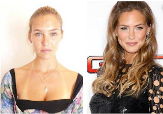
There's an element of mystery when booking a model on what you're going to get when the model arrives to shoot. Most of the time I will direct the model to come in without hair or makeup done, so I can direct the overall look. Some models photograph exactly like they look in reality. Others it's almost two different people. I booked a model and almost didn't recognize her when she showed up.

I found a bunch of photos of models, comparing what they look like au naturale and what they look like done up for work. So I thought I'd share them to better explain what I'm talking about. 


Makeup and lighting makes a huge difference in the world, but if the model doesn't know how to work the makeup and lighting, it's all for nothing. 

As you can see, the girl you wouldn't peg as a model on the street might turn into Heidi Klum in front of the camera.

Until next time...

Friday, July 6, 2012

A Little Bit of Rouge

OK, a little disclaimer to this post. I was not present at any of the shoots for the images presented. Just my judgements as a photographer.

I've been seriously working on my photography for about four years now. I've done a lot of experimentation, making mistakes along the way. One of the biggest things I've learned is dealing with makeup.

Makeup applied lightly doesn't really show up on camera. So the makeup must be applied liberally for the effect to be picked up on camera. Working with a makeup artist who usually works with photographers knows this. But if you're a photographer working with an artist that doesn't normally work on photo shoots, it's important to convey the information.

On set, the make up might look overdone and awful. But it was all smooth out in post.

On set, the makeup might seem like it looks like:
But the final image would look more like this:
OR, on set you might be seeing:
But it would be turned into something like this:
My suggestion would be to apply the makeup more than what you would normally and take a few test shots. If the look is what you want it to be that start shooting. If not, add a few more layers. These examples are a bit of an exaggeration but in the past I've told an artist that the makeup was good but then wasn't happy with how light it was on camera.

Hopefully this is helpful for you fellow photographers out there!

See you next time.
erinbeephotography.com